Theme blocks
Small ready-made parts you can combine in the Blocks section to build a row from scratch.
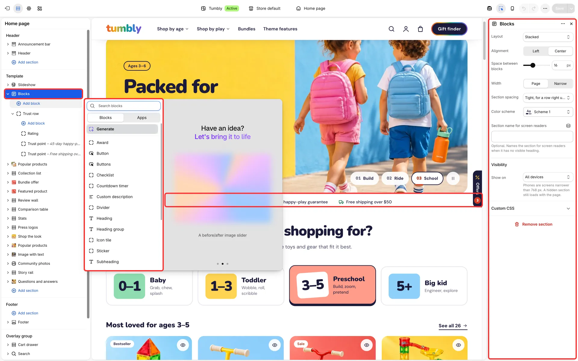
The blocks
Section titled “The blocks”- Subheading: Text, Style (Chip, Eyebrow, Tag, Line with icon or Star rating) and Icon.
- Heading: Heading, Size, HTML tag and Show when (Always, The cart has items, The cart is empty, Search found nothing or Before a search), so one section can carry a heading for each state of the cart or of search.
- Custom description: Text and Size.
- Buttons: two buttons, each with a label, link and style. Button: one button with Button style, Use a small button and Show arrow.
- Checklist, Text with icon, Icon, Icon tile and Inline text.
- Trust row: icon items and a rating line.
- Team faces: a row of round photos with a line of text.
- Award: an emblem (Laurel, Medal, Star, Verified check mark) with a heading and text.
- Sticker: a round or pill-shaped label that can be tilted, with its own color scheme.
- Countdown timer (see Countdown timer), Divider and Custom Liquid.
Good to know
Section titled “Good to know”- The Blocks section also has Layout, Alignment, Space between blocks, Width, Section spacing and Show on. See Blocks.
- Words you set in italics in a Heading block appear in the accent color with a hand-drawn underline. Set Theme settings → Layout → Highlighted words in headings to Same as the heading to keep headings in one color.