The Tumbly preset
For toys, ride-ons and everyday kit for children, built around shopping by the child’s age. Sunny coral, yellow, sky and mint palette, extra rounded corners and outlined buttons. Its templates come filled with sections in the order of its demo store, tumbly-qn09m1ah.myshopify.com.
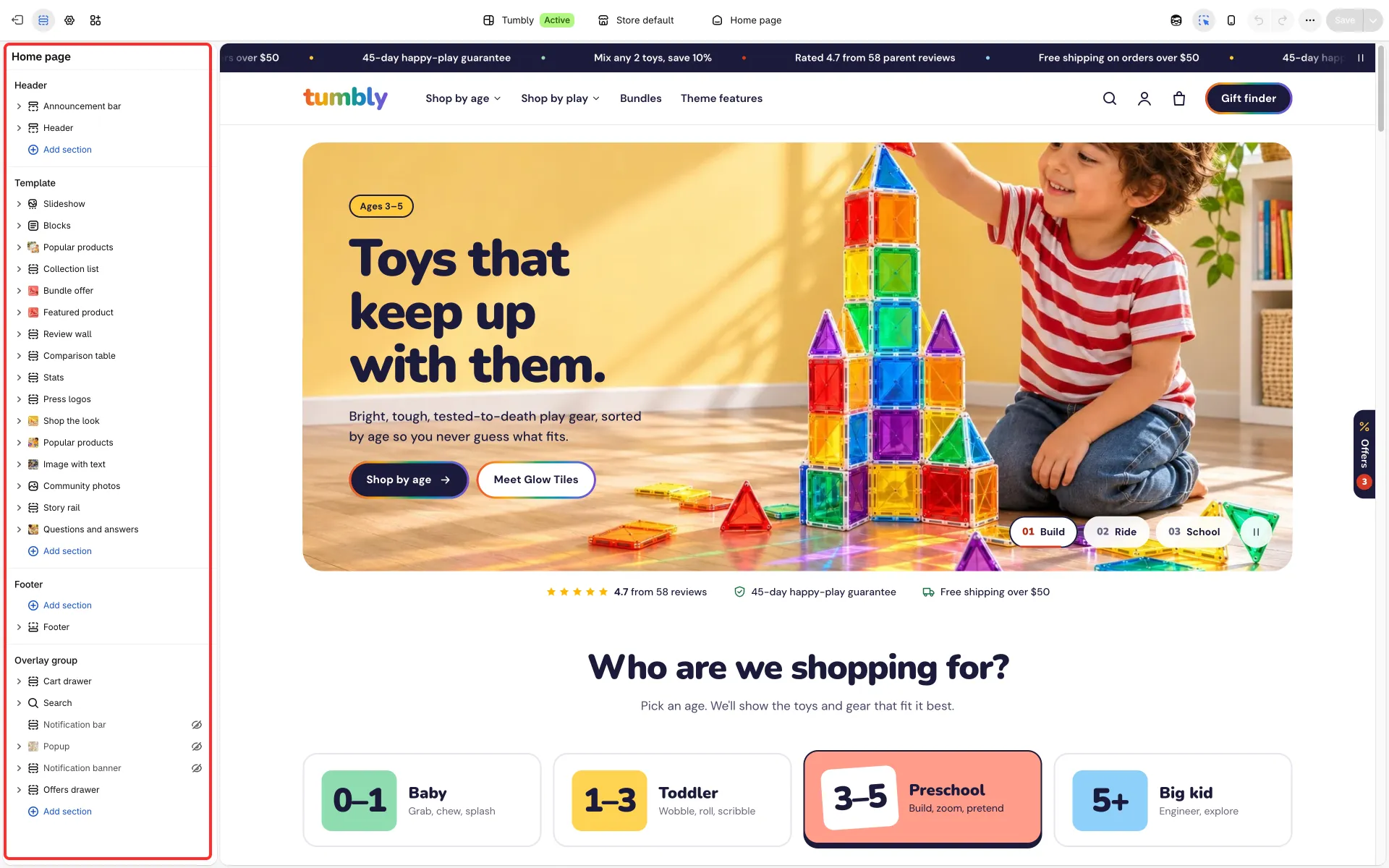
Built for toys and play gear
Section titled “Built for toys and play gear”Its sample texts (headings, chips, reviews placeholders, age words, the gift finder) speak about toys, ride-ons and play, and the sections are laid out for that kind of catalog. If you sell something else for children, such as clothing, replace those words in the theme editor: they live in section settings and blocks, not in code, and none of them shows on a product, collection or cart unless you add it.
Its header carries a call-to-action button (it opens all products after install; in the demo it opens the gift finder page, so point it at your quiz page once you have one) and a mega menu with Image tiles, and its footer and overlays (announcement ticker, newsletter popup, offers drawer) have their own texts. The Mobile bottom bar and the Offers drawer are on, as in the demo.
Templates
Section titled “Templates”| Template | Sections |
|---|---|
| Home page | Slideshow (numbered tabs), Blocks (proof row), Popular products (age tab cards: “Who are we shopping for?”), Collection list (bento, short titles), Bundle offer (card layout with the bundle’s products and a countdown), Featured product (highlight tiles and color swatches), Review wall (carousel beside a summary), Comparison table (beside its heading), Stats (compact colored tiles), Press logos, Shop the look (hotspots on a playroom photo, price on its own line), Popular products (gifts carousel, next card peeks on phones), Image with text (card without the soft glow), Community photos, Story rail, Questions and answers (cards with an image; the image is hidden on phones) |
| Product | Product information (panel laid out like the featured product: age tag chip, title, rating, short line, highlight tiles, round color swatches, price with the tax note, full-width buy buttons, trust row; below it one list of folds for the description, materials and safety, care, size and specs, shipping, then gifting and play-together extras as one list beside their heading; the trust highlights stack on phones; Show only the selected variant’s media is on; a text field and a photo upload field wait hidden until you give them a label), Review wall (beside a summary), Product recommendations, Recently viewed (hidden) |
| Collection | Collection (age cards and play chips above the grid, coral promo tile with balanced heading lines), Popular products (shown only when the collection is empty), Collection list (bento, short titles) |
| Collections list | Collections page, Banner grid, Collection spotlight |
| Search, Cart, 404 | The same sections as Upbeat; on the cart page Popular products has age tabs |
| Blog / Article | Blog and Newsletter / Article, Popular products, Story rail |
Page about |
Media banner, Stats, Image with text (card without the soft glow), Gallery carousel, Comparison table, Shop the look (price on its own line), Press quotes, Questions and answers, Lookbook |
Page faq, contact |
As in Upbeat |
Page stores |
Stores (a stockists list without filters, with a Google map that loads with the page; see Stores) |
Page quiz |
Product quiz, set up as a three-question gift finder (age, kind of play, budget) |
Page features |
Rich text, Image with text (six, cards without the soft glow), Feature columns, Rich text: a “Why us” page |
Its theme settings
Section titled “Its theme settings”Button style: Outlined, Card style: Photo, Space between sections: Compact, Button font: Body font, Highlighted words in headings: Same as the heading, Small details: Text color, Button outline: Rainbow and gold Rating stars and Small rating stars (see Layout and Colors). Section options give the rest: the options in brackets in the table above. Each of them works in any preset.
Section options that give Tumbly its look
Section titled “Section options that give Tumbly its look”| Where | Option | What it does |
|---|---|---|
| Header | Button position | Puts the header button before the icons or after the cart |
| Announcement bar | Text style | Regular text with accent dots, or semibold text with dots in the palette’s colors |
| Slideshow slide | Soft light behind the text | A faint white glow behind the text on desktop, for busy photos |
| Popular products | Tab open on load | Which card tab is open when the page loads, counted from the left |
| Collection list | Short title (in the collection card block) | Shows the collection’s short menu name (custom.nav_title) instead of its title; a Button block can sit in the heading row |
| Featured product | Details layout: Highlight tiles, color swatches, price beside the button, Add button label | The product’s perks as tiles, color swatches, and the price beside the button; the label sets the button text (“Add to bag” in Tumbly, empty keeps “Add to cart”) |
| Review wall | Layout: Carousel beside a summary | Review cards in a carousel next to the score card |
| Comparison table | Layout: Heading beside a framed table | The heading and a button sit beside the table |
| Stats | Style: Compact colored tiles, Remove top spacing | Smaller tiles; no top padding when the stats continue the section above |
| Image callouts | Picture: Square photo with rounded corners | A photo instead of a product close-up |
| Questions and answers | Hide the image on phones | Keeps the cards layout’s image on larger screens only |
| Product panel | Layout: Like the featured product, Highlight tiles block, Price Show tax and shipping note | Short line under the rating, perk tiles from custom.perks, the tax note under the price, bold trust perks; the gallery’s sale badge hides when the price shows the saving |
| Collection | Collection links Photo style: Age cards for collections with a badge, promo tile Use a color scheme | Collections with a custom.badge metafield (for example “3–5”) show as age cards with a colored number badge (custom.badge_color), the rest as chips; the promo tile takes a color scheme instead of the pale panel |
| Popular products | Products per row on mobile: Swipe row, next card peeks | Works in the grid and the carousel layouts |
| Footer newsletter | Heading, Button label | A heading above the field, and a labelled button beside an outlined field instead of the round arrow |
Shopping by age
Section titled “Shopping by age”See Popular products.