The Dewpop preset
For skincare, body care, sun care and lip products, built around one color per product, a skin quiz and a shoppable shelf. Cream page with a pastel color for each product, heavy open-spaced headings, pill buttons and inset product cards. Its templates come filled with sections in the order of its demo store, a skincare brand with 29 products: dewpop-yirjgbks.myshopify.com.
Built for skincare and beauty
Section titled “Built for skincare and beauty”Its sample texts (headings, chips, claims, reviews placeholders, the skin quiz, the ingredient steps) speak about skin, routines and ingredients, and the sections are laid out for a catalog of cleansers, serums, moisturizers, sunscreens and sets. Replace those words in the theme editor for another kind of product: they live in section settings and blocks, not in code. The product-by-product claims in the demo (percentages, “derm-tested”, “60-day returns”, press quotes, review texts and creator handles) are sample content: replace them with statements you can support, and turn a section off if you have nothing true to put in it.
Its header (logo in the center, the menu in a drawer with Menu pictures: Thumbnails and top products, Search, Account and Cart as words), footer (four colored perk tiles, a large logo, a newsletter and three link columns) and overlays have their own texts.
Templates
Section titled “Templates”| Template | Sections |
|---|---|
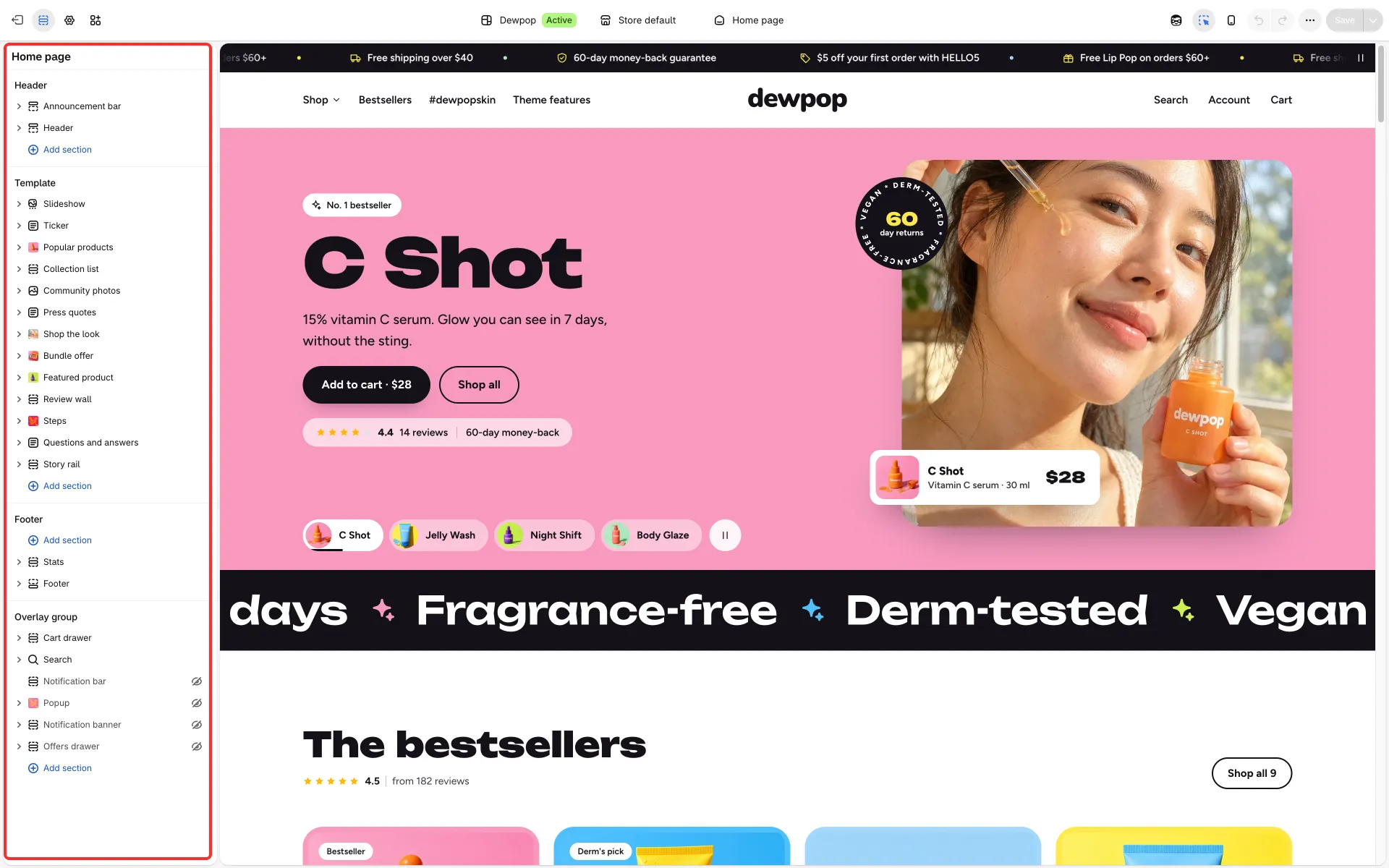
| Home page | Slideshow (a color band with a framed photo per product, tabs that show each product, a rating, Add to cart and a round badge), Ticker (large claims), Popular products (pastel cards), Collection list (concern tiles), Community photos (tall creator cards), Press quotes (one large quote, logos switch it), Shop the look (photo with product list), Bundle offer (photo and offer side by side), Featured product, Review wall (masonry under a score bar), Steps (timeline with a sticky image and pills), Questions and answers, Story rail |
| Product | Product information (inset panel, highlight tiles, Volume pricing waiting hidden until you enter tiers, add to bag, sticky bar on phones), Review wall, Product recommendations, Recently viewed |
| Collection | Collection (concern chips above the grid), Collection list, Popular products (shown only when the collection is empty) |
| Collections list | Collections page, Collection spotlight, Banner grid |
| Search, Cart, 404 | Search and cart with product picks; the 404 page with product picks |
| Blog / Article | Blog and Newsletter / Article, Popular products, Story rail |
Page about |
Media banner, Stats, Image with text, Gallery carousel, Comparison table, Shop the look, Press quotes, Questions and answers, Before and after |
Page faq, contact |
Questions and answers with a help row / Contact form with quick answers |
Page stores |
Stores |
Page quiz |
Product quiz, set up as a three-question skin quiz (skin type, concern, first step) |
Page features |
Rich text, Image with text, Feature columns: an “Ingredients” page |
| Footer group | Stats (four colored perk tiles), Footer |
A page is assigned a template through its Theme template field; the demo’s pages use about, faq, contact, quiz, stores and features.
Its theme settings
Section titled “Its theme settings”The heading font is a heavy wide face with Heading letter spacing: Open, Card style: Inset photo, Space between sections: Medium, Header style: Flat, Button font: Body font, Highlighted words in headings: Same as the heading, Small details: Text color, Corner radius: Extra rounded and a Page width of 1368.
The signature parts
Section titled “The signature parts”- One color per product: the slideshow’s color band. See Slideshow.
- The skin quiz: the quiz page uses the Product quiz section with three question blocks, each with answer blocks, and one Result rule block for each combination of answers that you want a specific product for. Rules list the answers they match (for example
dry, dullness) and pick products; when no rule matches, the fallback products show. The demo’s rules name its own products, so pick yours in each rule before you publish. See Product quiz. - Shop the shelf: see Shop the look.
Section options added for Dewpop
Section titled “Section options added for Dewpop”Each works in every preset and defaults to the earlier look.
| Where | Option | What it does |
|---|---|---|
| Slideshow | Text placement: Color band with a framed photo | The slide is one color band (its panel color scheme) with the text beside a rounded photo |
| Slideshow slide | Product, Show an add to cart button, Show the rating, Note beside the rating, Larger heading, round badge (ring text, big word, small line) | A product card on the photo, Add to cart on the slide, a rating line, and a rotating badge |
| Ticker | Text size: Large, Icon block Color | Big claim text with colored separators |
| Press quotes | Layout: Large quote, logos switch it, Small label above the quote, Autoplay, Logo width | One large quote that changes when a logo is chosen, and optionally on its own; a pause button shows when it plays |
| Community photos | Carousel card: Tall photo with caption and product on it | The creator card used in the demo’s feed |
| Review wall | Layout: Masonry wall under a score bar, Country, Show a “Verified” mark, Photo (review block), Show a larger rating (Review summary block) | Review cards of different heights under a score summary. Turn on Show a “Verified” mark only when your review app or order records confirm each review |
| Bundle offer | Layout: Photo and offer side by side, Sticker text | A round sticker on the photo with the saving in percent |
| Shop the look | Layout: Photo with product list, List heading, Total label, Amount saved on the whole set, Heading alignment, Open a card when the page loads, Card to open | See Shop the shelf; the last two choose which dot’s card starts open |
| Steps | Layout: Timeline beside an image options Pills under the steps, step Image and Image caption | A sticky picture that swaps when a step scrolls into view, and one-line pills such as “leaf: 100% vegan” |
| Stats | Style: Edge-to-edge strip (icon, bold title and a line, no heading) | Icon, bold title and a line in a full-width strip, no heading |
| Story rail | Small label above the heading, Link style: Outlined button; article card Colored tag pill under the image | A label over the heading, an outlined button beside it, and a tag chip in the card’s color |
| Popular products | Shrink bottom spacing | Pulls the next section closer |
| Product panel | Smaller tiles on phones | The highlight tiles use less height so the buy button comes sooner |