Product cards
How a product looks in grids, rows and search results.
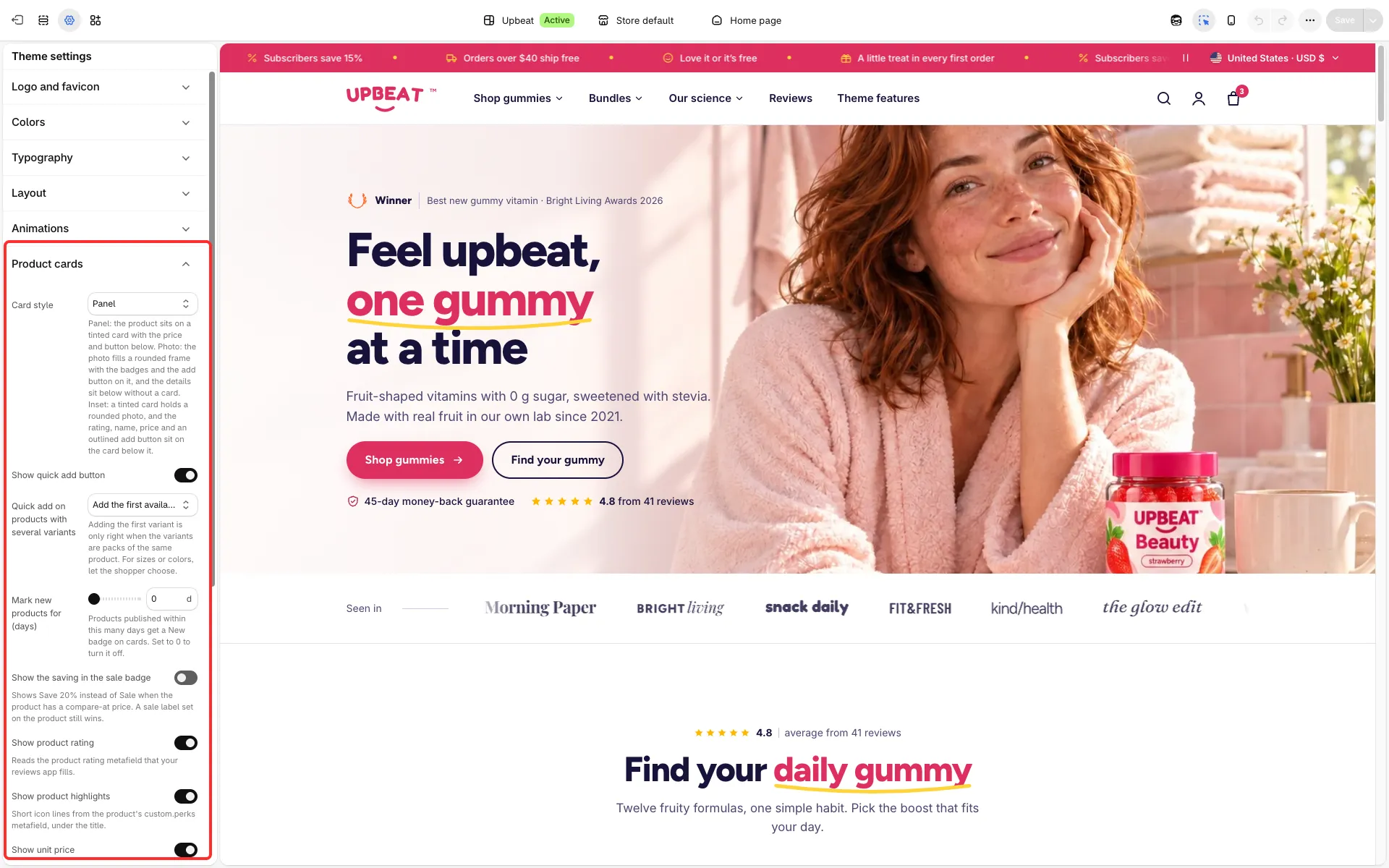
Main settings
Section titled “Main settings”- Card style: Panel (tinted card, price and button below), Photo (the photo fills a rounded frame with badges and the add button on it) or Inset photo (a rounded photo in a tinted card, details below).
- Show quick add button and Quick add on products with several variants (Open the quick view to choose or Add the first available variant; the second is right only when the variants are packs of the same product).
- Mark new products for (days): products published within this many days get a New badge. 0 turns it off.
- Show the saving in the sale badge: “Save 20%” instead of “Sale”.
- Show product rating, Show product highlights (icon lines from
custom.perks), Show unit price and Name of one item. - Icon for products without an image: Box, Gift or Jar.
Good to know
Section titled “Good to know”- A card shows the price, the sale badge and the add button of the product’s cheapest available variant, so a sold-out variant on sale does not put a Sale badge on the card.
- Each section’s Product card block also has its own Show rating and Show unit price switches, off by default; they need the theme-wide switches here too.