Feature showcase
A heading with a grid of feature cards. Each card has a heading and a colored tile with pictures (plain, in a browser window frame or in a phone frame) or a short chat, or is text only. Use it to show what your store or product does, with pictures.
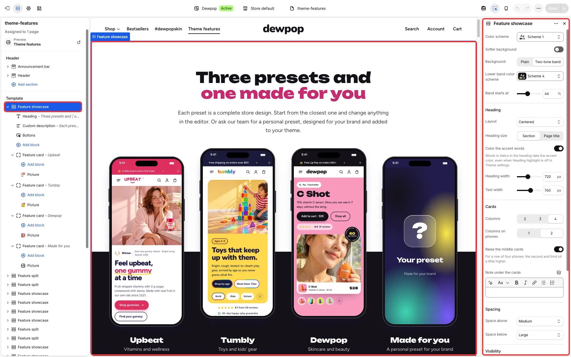
Main settings
Section titled “Main settings”- Columns (2, 3 or 4), Column widths, Columns on phones and Raise the middle cards.
- Heading: Layout, Heading size and Color the accent words.
- Background: Plain or Two-tone band, with Lower band color scheme.
- Note under the cards, Space above and Space below.
- Each Feature card block: Card style, Card width (one column, two columns or the full row), Heading, Count after the heading (a pill such as “+14 layouts”), Text, Link, the tile’s Color scheme and Pictures layout, Hide on phones and Hide on tablets.
- Inside a card: Picture blocks (Frame: none, browser window or phone; Phone image; Hide on phones) and Conversation blocks.
Good to know
Section titled “Good to know”- On tablets a 3-column grid shows its cards in pairs (exactly three cards stay in one row), and a lone last card spans the row with its picture beside the text.
- Its presets are Feature showcase, Phone screens and Headline with buttons.