Product information
The main section of every product page: the media gallery with badges on one side, the product panel on the other, and the details and extras below. Change how the gallery looks here; the panel, details and extras have their own articles.
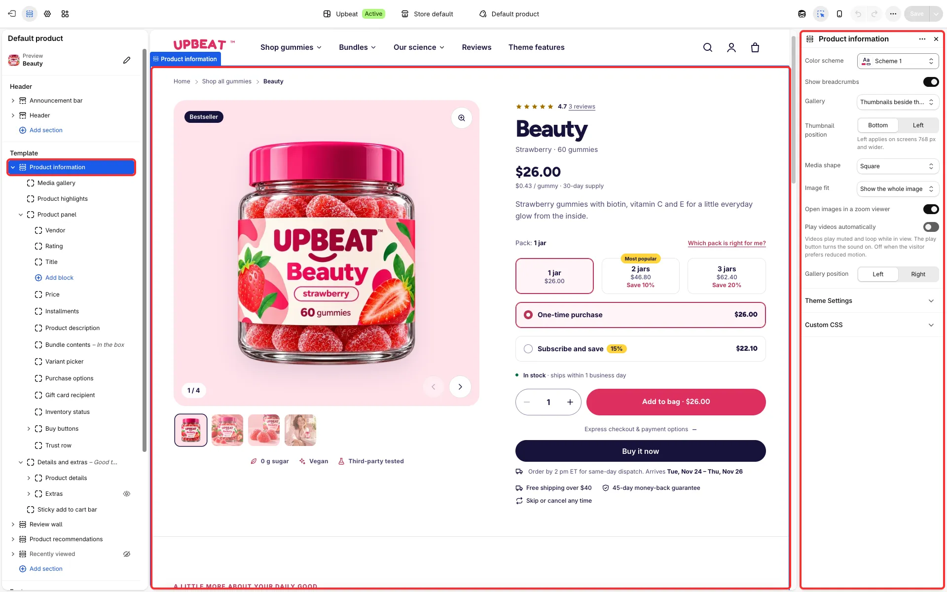
Main settings
Section titled “Main settings”- Gallery: Thumbnails beside the image, Carousel without thumbnails, Grid or Stacked. Gallery position: Left or Right.
- Thumbnail position: Bottom, or Left from 768 px (for the thumbnails gallery).
- Media shape: Square, Portrait, Landscape or Match the first image. Image fit: Show the whole image or Fill the frame.
- Open images in a zoom viewer: the zoom button opens a full-screen viewer; zoom in with a click or the zoom button, then look around with the mouse or the arrow keys.
- Play videos automatically: uploaded videos play muted and loop while in view, with a button for sound and a pause button. They stay still for visitors who prefer reduced motion.
- Show breadcrumbs and Color scheme.
- Product highlights block (the chips under the gallery): up to three icons with a text each, and Stack highlights on phones.
- Media gallery block: Show only the selected variant’s media (see Variants and photos).
Good to know
Section titled “Good to know”- Videos and 3D models play in place. Pack photos attached to a variant show when that variant is chosen.
- The title area and the badges stay in place; everything else can be reordered within its part.
- The section has no Show on setting.