Feature columns
Short points with an icon or image, a heading and a line of text, in columns, a carousel or a row of link pills. Use it for benefits, shop promises or links to help pages.
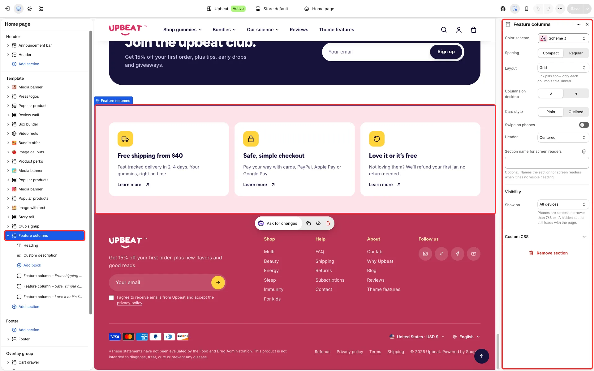
Main settings
Section titled “Main settings”- Layout: Grid, Carousel or Link pills.
- Card style: Plain or Outlined cards.
- Columns on desktop (3 or 4), Swipe on phones and Show dots.
- Header: Centered, or Heading left, link right.
- Spacing: compact or regular.
- Each Feature column block: Icon or Image, Heading, Text, Link label, Link and Link icon. A Group heading block starts a new group of columns.