Layout
The shapes and spacing of the whole store: page width, corners, buttons and the space between sections.
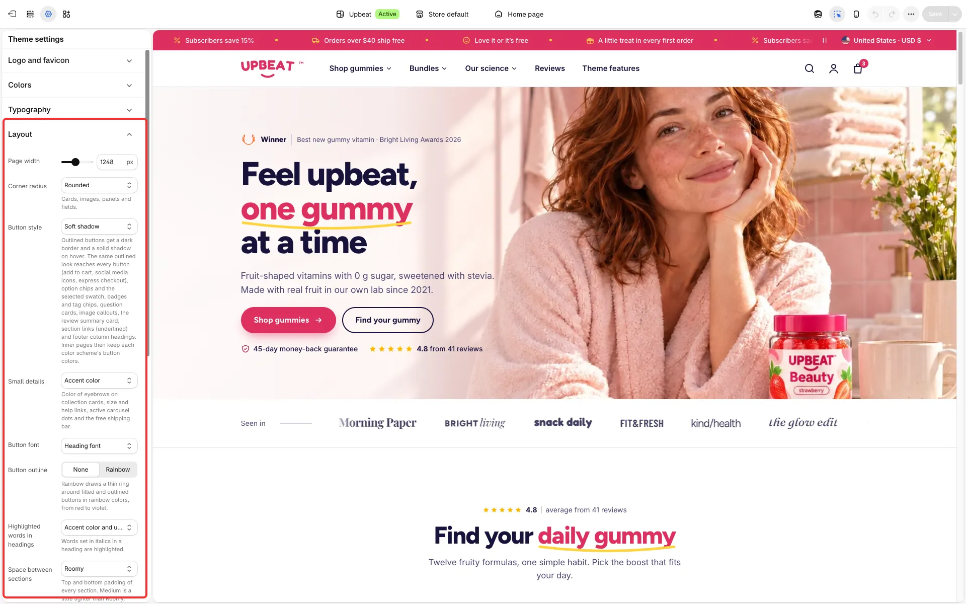
Main settings
Section titled “Main settings”- Page width: how wide the header, the footer and the sections get on large screens, the same on every page.
- Corner radius: Subtle, Rounded or Extra rounded (cards, images, panels and fields).
- Button style: Soft shadow or Outlined. Outlined gives buttons a dark border and a solid shadow on hover and brings the same look to option chips, badges, question cards, section links and footer column headings.
- Button font: Heading font or Body font. Button outline: None or Rainbow (a thin rainbow ring around buttons).
- Highlighted words in headings: Accent color and underline or Same as the heading. Words you set in italics in a heading are highlighted.
- Small details: Accent color or Text color (eyebrows, help links, active slider dots, free shipping bar).
- Space between sections: Roomy, Medium or Compact. Tighter space between same-color sections halves the gap between neighbors with the same color scheme.
- Header style: Standard or Flat (a little taller on large screens, with a thin line instead of a shadow).
- Back to top button: a round arrow in the bottom corner after the shopper scrolls down about one and a half screens; on phones it shows when the shopper then scrolls back up.
Good to know
Section titled “Good to know”- On inner pages, buttons with Outlined keep each color scheme’s own button colors.
- Italic highlight words: Box builder keeps italics as italics, and the Collections page uses its own Highlighted word setting.