Colors
The palette of the whole store, plus the color schemes that sections use. Change a color once and every section that uses it follows.
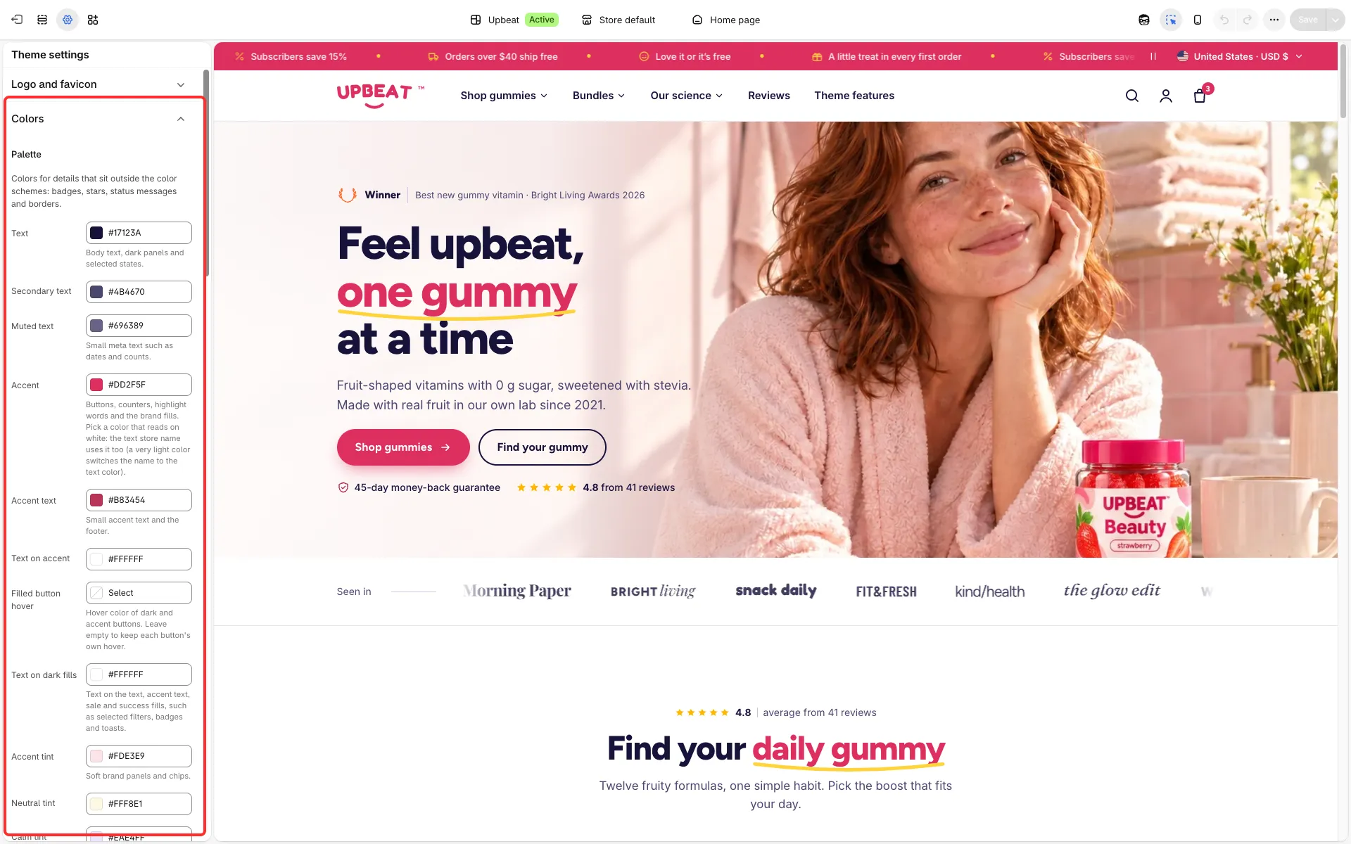
Main settings
Section titled “Main settings”- Palette: Text, Secondary text, Muted text, Accent, Accent text, Text on accent, the tints (Accent tint, Neutral tint, Calm tint, Highlight, Fresh and others), Sale, Success, Error, Information, Borders and Field borders.
- Stars: Rating stars (large stars) and Small rating stars (cards, the product page and quick view).
- Panel tints: soft panels used by the catalog, contact, help center, cart and product page.
- Color schemes: the schemes sections pick with their Color scheme setting.
Color schemes
Section titled “Color schemes”A scheme sets the background, text, button and accent colors for one section, so bright and calm sections can alternate down a page. The theme ships fifteen: white, cream, blush, deep navy, lilac, pale lilac, pink, berry, pale lime, sunshine, coral, lime, sky, lemon and pale sky. In the editor schemes are picked by their colors. In the Upbeat style lemon has the same colors as sunshine and pale sky the same as sky; change one of each pair if you want them to differ.
Good to know
Section titled “Good to know”- Pick an Accent that reads on white: with a very light accent the store name switches to the text color and the accent dots get dark text, but Text on accent stays as you set it. The editor cannot warn you about this, so check it yourself.
- The coral scheme puts white text on coral at a contrast of 3:1, enough only for large text (24 px, or 19 px bold). Use another scheme for small text, or a darker coral. Normal text needs at least 4.5:1; a free checker such as WebAIM’s contrast checker tells you.