Collection page
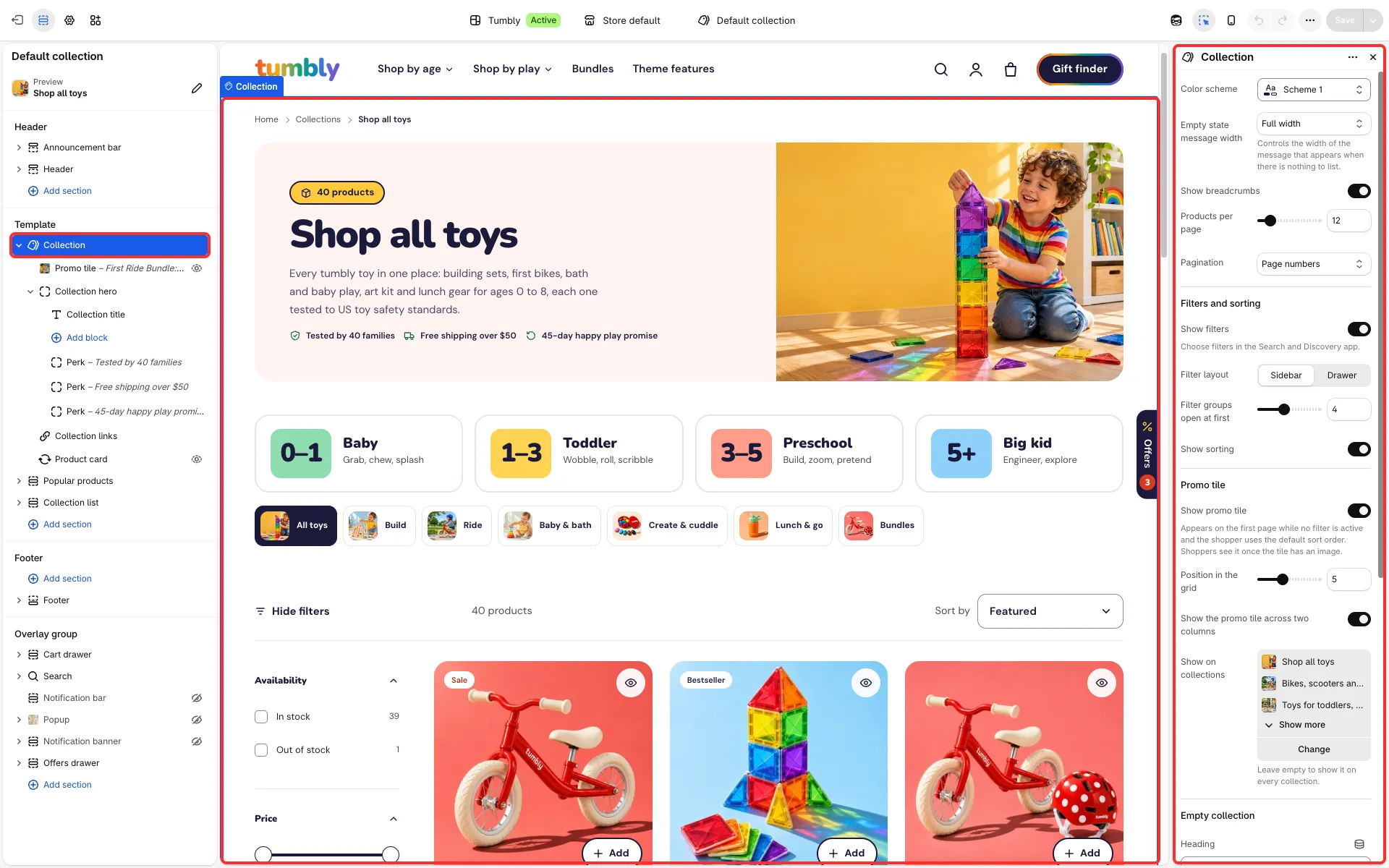
A collection’s page: header with image and description, filters, sorting and the product grid.
Main settings
Section titled “Main settings”- Products per page and Pagination: Page numbers, Load more button or Infinite scroll (with Loading text).
- Filters and sorting group: Show filters, Filter layout (Sidebar or Drawer), Filter groups open at first and Show sorting.
- Promo tile group: Show promo tile, Position in the grid, Show the promo tile across two columns and Show on collections. The Promo tile block has an image, text and a button.
- Collection hero block: Show product count, Show description, Show image, Image position and Perk blocks.
- Collection links block: Collections and Photo style (Plain, On a color square or Age cards for collections with a badge).
- Empty collection group: heading, text and two buttons.
Good to know
Section titled “Good to know”- Shopify’s Search and Discovery app sets which filters show. A filter with more than eight values shows the first eight and a Show more link; the product count in the header follows the active filters.
- Product cards sit in three columns (four with drawer filters, two on phones).
- The row of collection links lists up to twelve of your store’s collections that have products (the home page collection left out) until you pick the ones to show.
- The promo tile shows only with an image.
- Age cards use the collection’s
custom.badgeandcustom.badge_colormetafields (see Metafields).